BradenLive
Things I write live here
Kellogg Course Closing Costs: Driving Factors
Introduction
For DECS 922 “Data Exploration” with Professor Robert McDonald, I was asked to complete a final project in lieu of a final exam. At the time this assignment was given to us, the entire student body was struggling to decide how to allocate their bid points for the Spring 2019 quarter. One issue that many students have complained about is the fact that the TCE scores are managed in a separate system from the bid stats system, leaving no easy way to use both datasets to make informed decisions.
I thought this was a perfect opportunity to use what I learned in DECS 922 to make all our lives easier. The end result is the Bidding and TCE Visualization Tool, or BidVis:
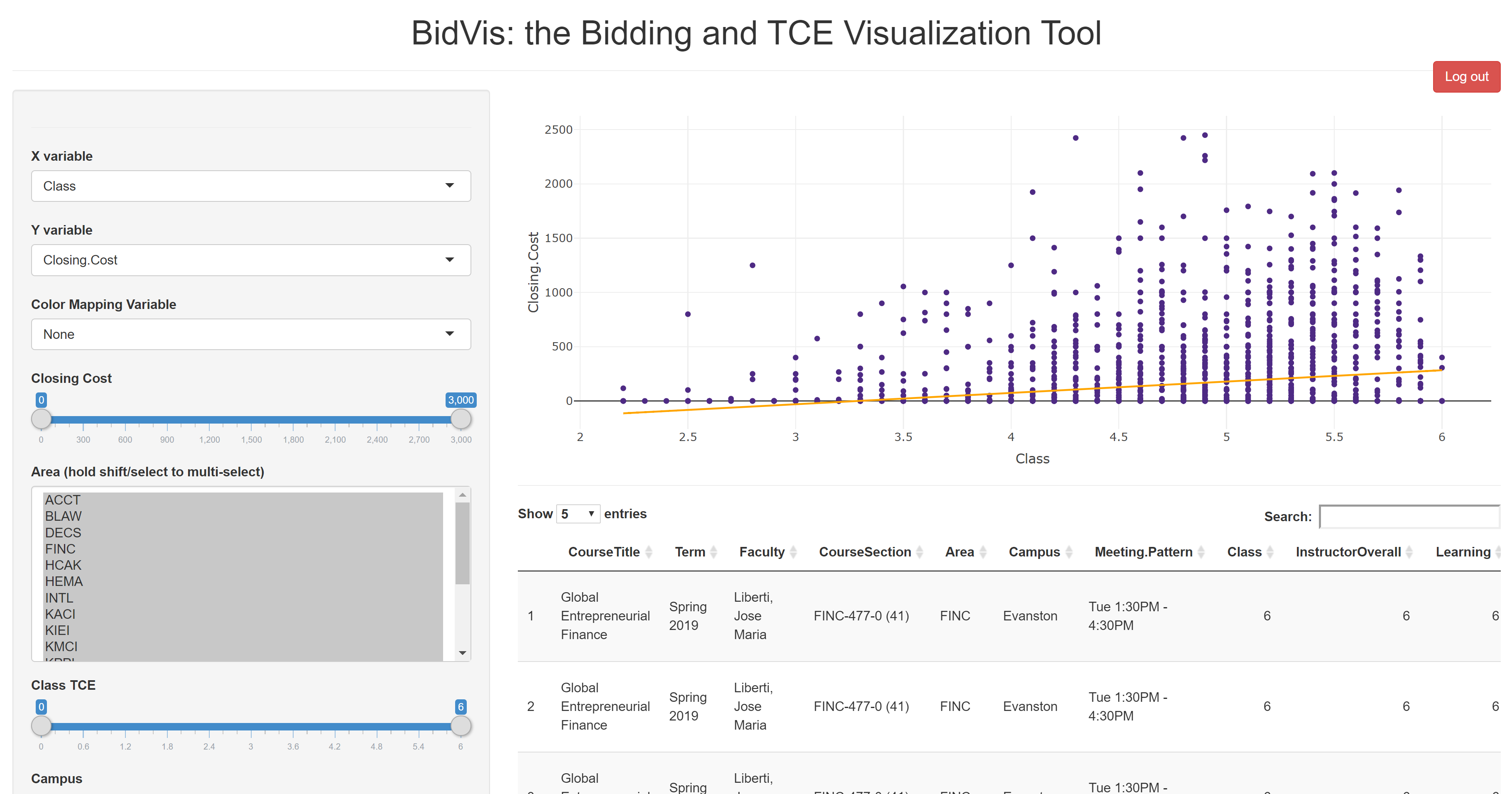
BidVis is currently password protected, but the password will be posted in Slack. Let me know if you think of a better name for it. Also, please feel free to send me an email with any comments or critiques!
Some interesting points I learned from the data are below, along with my steps to prepare the data for use.
In speaking with my classmates and from my own experience, I sought to use the data to answer the following questions:
Cleaning the Data
The source of all data is Kellogg’s Course Planning Tool.1 2 The first step is to download the files, and then join them together by matching rows on the CourseTitle, Term, Faculty, Area, Campus, and Meeting Pattern columns.
tce <- import('ctec full.csv')
bids <- import('BidStats full.csv')

## join TCE and bidstats files
full_data <- left_join(tce, bids, by=c('CourseTitle',
                                       'Term',
                                       'CourseSection',
                                       'Faculty',
                                       'Area',
                                       'Campus',
                                       'Meeting Pattern'))

## remove spaces from all variable names
names(full_data)<-make.names(names(full_data),unique = TRUE)

## remove all records with no associated bid stats
incompletes <- full_data %>% filter(is.na(full_data$Closing.Cost))
full_data <- full_data %>% filter(!is.na(full_data$Closing.Cost))
1626 bidding records that have no matching TCE records associated with them must be removed. This ensures that no TCE is matched with incorrect bid stats. The data is now complete, but needs to be formatted for the visualizations and regressions that are a part of BidVis.
Preparing the Data for Visualization
Next, I will split the Term column into Year and Quarter to be able to visualize on those variables. I’ll also apply ‘levels’ to Term so that they can be ranked against each other on an x- or y-axis:
## add year and quarter variables
full_data$Year <- as.numeric(str_extract(full_data$Term, "[0-9]+"))
full_data$Quarter <- (str_extract(full_data$Term, "[aA-zZ]+"))
levels(full_data$Quarter) <- c('Winter', 'Spring', 'Summer', 'Fall')
full_data$Quarter <- as.factor(full_data$Quarter)

## create additional variables to order `Term` by year and quarter
termlevels <- data.table(Term=as.character(unique(full_data$Term)))
termlevels$Year <- as.numeric(str_extract(termlevels$Term, "[0-9]+"))
termlevels$Quarter <- (str_extract(termlevels$Term, "[aA-zZ]+"))
termlevels$Quarter <- factor(termlevels$Quarter,
                             levels=c('Winter', 'Spring',
                                      'Summer', 'Fall'))
termlevels <- arrange(termlevels, Year, Quarter)
full_data$Term <- factor(full_data$Term, levels=termlevels$Term)
For some of the visualizations to work correctly in the app, there needs to be a column which has a unique value in every row- the ID column. Finally, all remaining chr columns must be changed to factor, again so that they can be compared to each other on a graph:
## add an ID column to make each record unique
full_data$ID <- 1:nrow(full_data)

## change all character columns to factors
full_data[,1] <- as.factor(full_data[,1])
full_data[,3] <- as.factor(full_data[,3])
full_data[,4] <- as.factor(full_data[,4])
full_data[,5] <- as.factor(full_data[,5])
full_data[,6] <- as.factor(full_data[,6])
full_data[,7] <- as.factor(full_data[,7])
full_data[,23] <- as.factor(full_data[,23])

## save the final result to be accessed by the app
save(full_data, file='full_data.rda')
The data is now ready to be used by BidVis. Currently, BidVis is not tied into a live feed from the Course Planning Tool data sources, so I will update manually after each bidding round every quarter.
Predicting a Course’s Closing Cost
I ran a regression on the full dataset to see if a predictive model could be developed. Unfortunately, with a standard linear regression, the R2 maxed out at 0.577 and so cannot be relied upon to make an accurate prediction. Other models, including recursive regression and random forest models, also proved unfruitful. The linear regression model coefficients are below; this at least shows the most powerful factors at play that determine a course’s closing cost. They cannot be used to accurately predict a course’s closing cost.
$Closing Cost = \beta _{0} + \beta _{1}*Quarter + \beta _{2}*Year + \beta _{3}*CourseTitle + \beta _{4}*Faculty + ...$
Many of the variables, such as CourseTitle and Faculty, are not continuous- so there must be a dummy variable created for each unique course or faculty. The results of the regression are below:
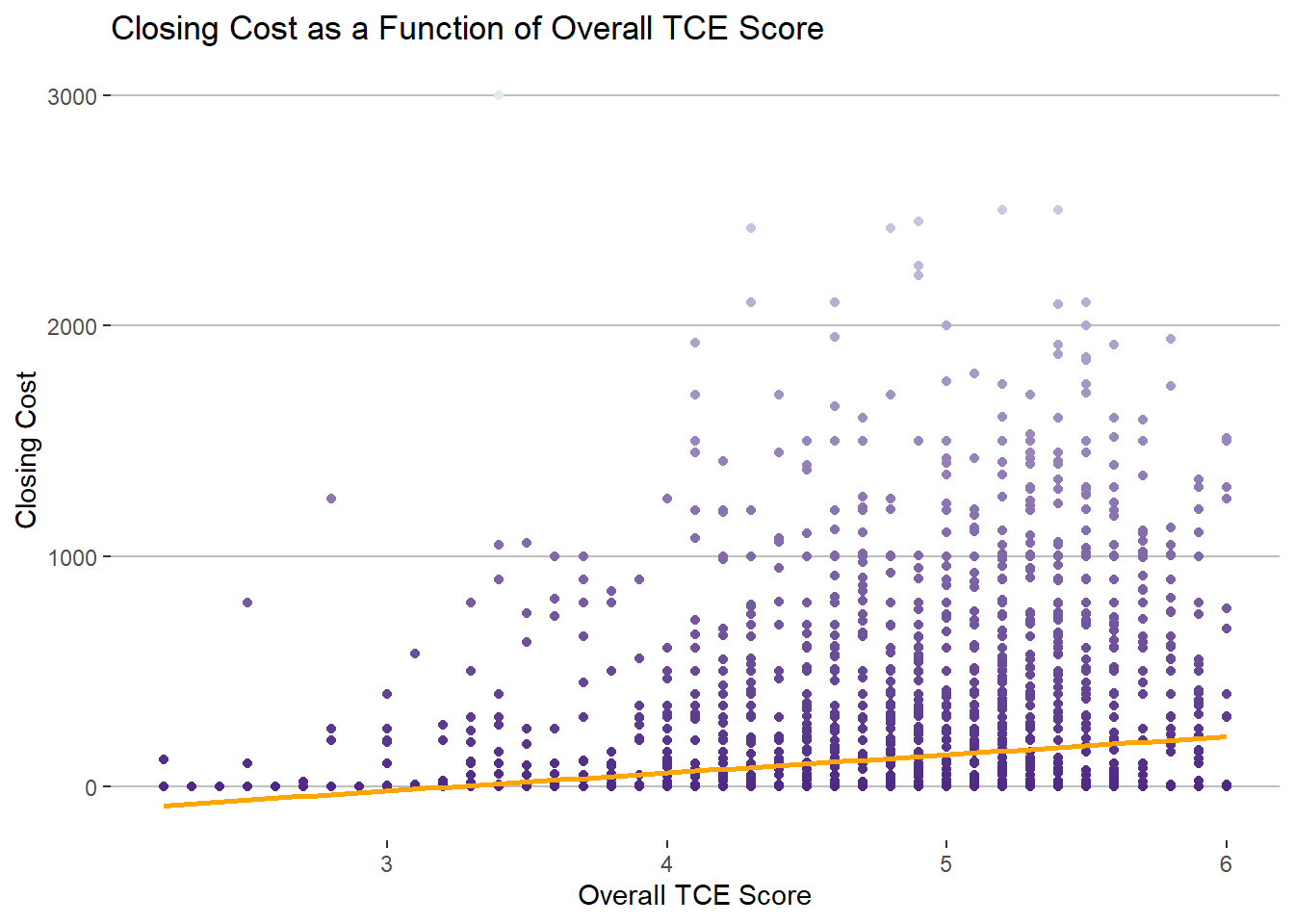
Relationship between TCE scores and Closing Cost
Right off the bat, we can see the full dataset shows that as overall TCE score for a course increases, then closing cost increases (slightly):
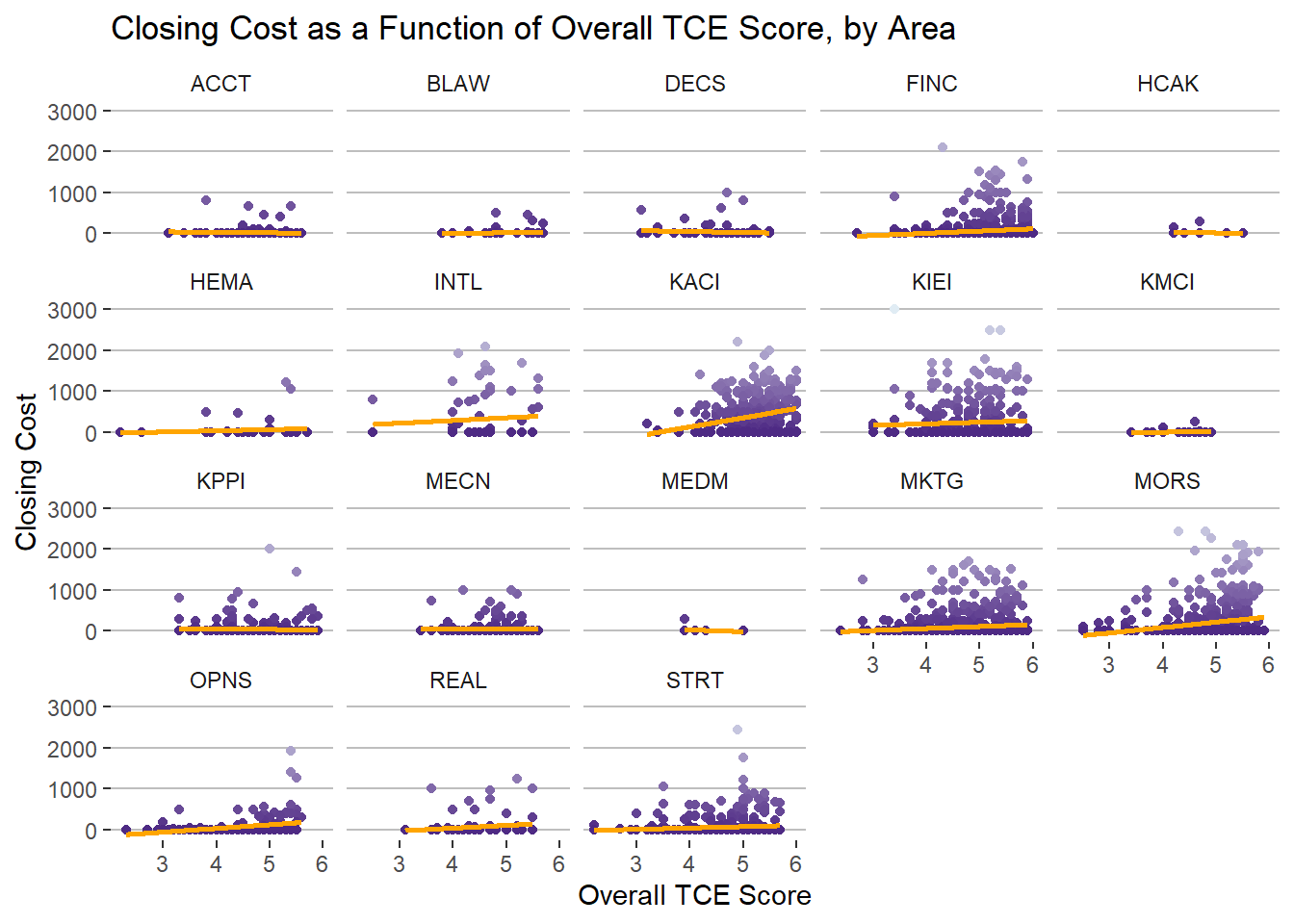
There is significant variation in the relationship between closing cost and overall TCE score when looking at each academic department individually:
Interestingly, we can actually see that when looking only at courses that went for a high closing cost, there is an inverse relationship with TCE score:
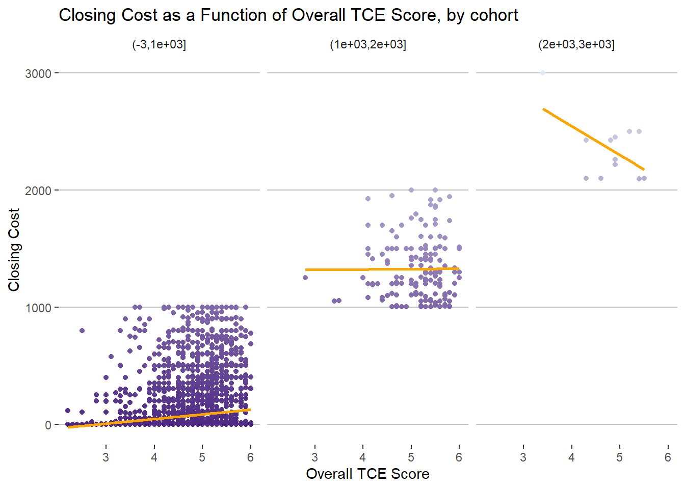
This could be the effect of students having impossibly high expectations for classes that cost a large amount of bid points.
The Bid Point Inflation Effect?
There is not strong evidence of classes going for progressively more points each quarter:
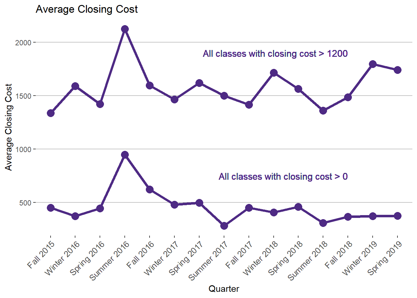
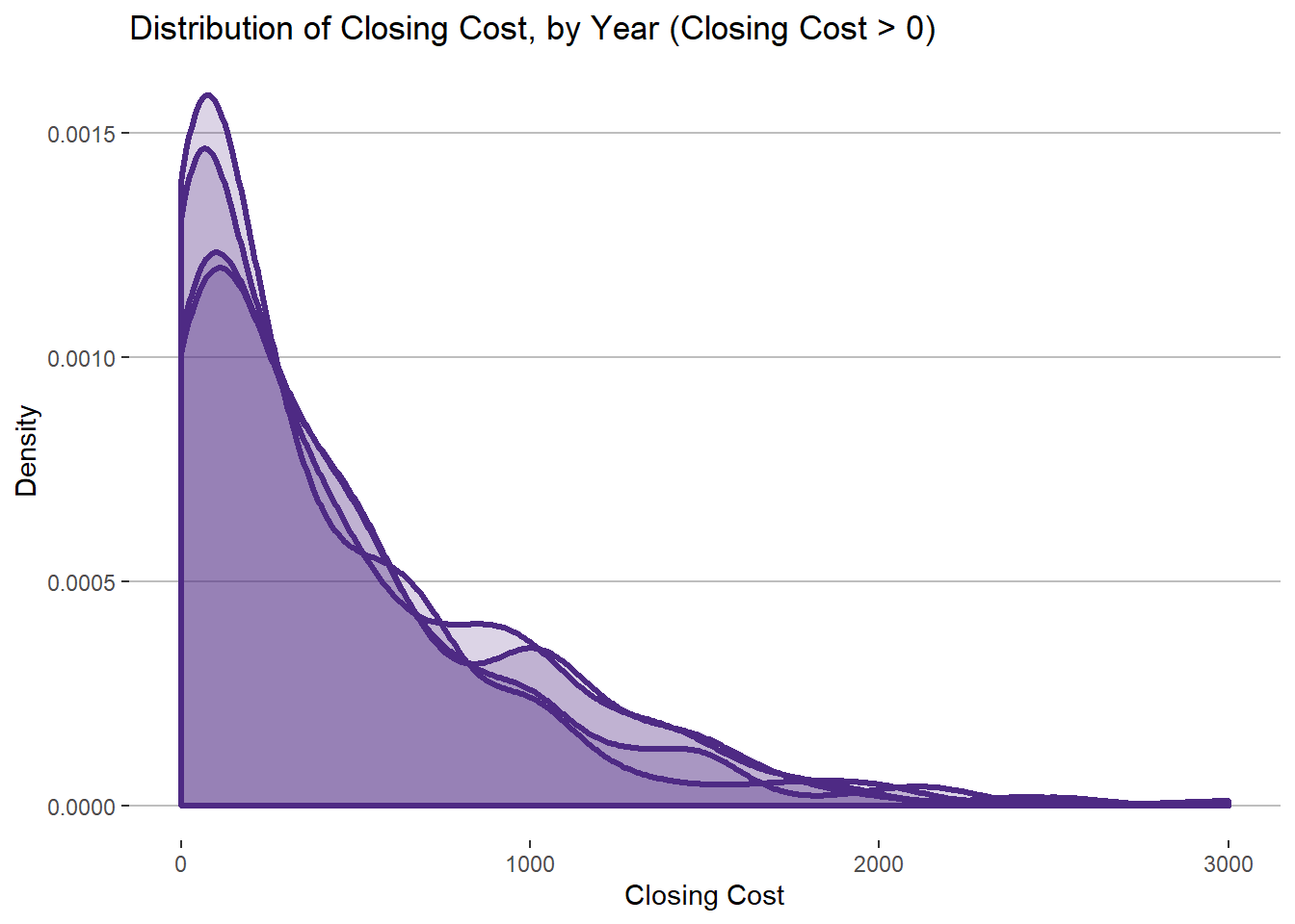
This makes sense, as there are a finite amount of points available within the whole student body. Over time, courses have not gotten significantly more expensive. In fact, the distribution of closing costs has remained relatively constant every year:
Conclusion
I believe there is more insight to be gleaned from this dataset. Using the BidVis tool, Kellogg students should be more easily able to discover those insights as well as make better choices when allocating their bid points every quarter. It can never hurt to have more information, and I hope this project bring value to the Kellogg community.
Kellogg School of Management, Northwestern University. (2019). Teacher/Course Evaluations. Retrieved from https://www4.kellogg.northwestern.edu/CoursePlanning/CTEC/CTECScreen?↩
Kellogg School of Management, Northwestern University. (2019). Historical Bidding Statistics. Retrieved from https://www4.kellogg.northwestern.edu/CoursePlanning/BidStats/BidStatsScreen?↩